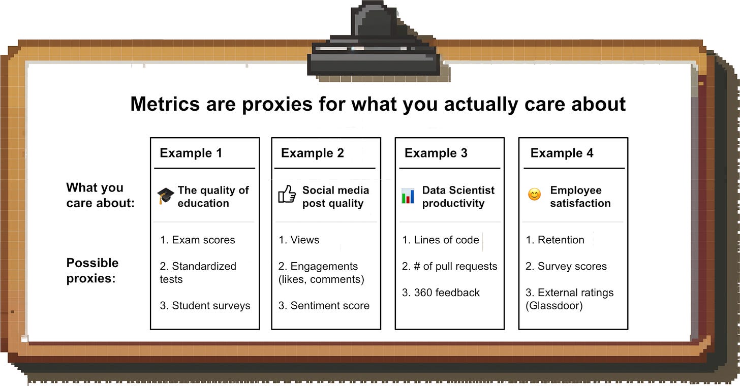
Metrics are a powerful tool; they help you measure what you care about. Having lofty goals is great, but to know if you’re making progress, incentivize your team and create accountability, you need to be able to express them in numbers.
But that’s easier said than done. There are dozens of metrics that seemingly measure the same thing, and new trendy metrics are invented every day. Which ones should you use and what should you avoid at all costs? This article will help you decide that.
Over the last decade I have been living and breathing metrics and have found that there are a few general principles that distinguish good metrics from bad metrics.
In this post, I will be digging into these principles one-by-one and provide concrete examples for each that will help you avoid costly mistakes. In a follow-up post, I will zoom out and discuss how to choose and align metrics across the various levels and teams within a company.
9 Principles for good metrics
Principle 1: A metric should be a good proxy of what you’re trying to measure
You typically cannot directly measure the exact thing you care about.
Let’s say my goal was to improve the quality of my newsletter posts; how do I measure progress against that? “Quality” is subjective and there is no generally-accepted formula for assessing it. As a result, I have to choose the best (or least bad) proxy for my goal that I am actually able to measure. In this example, I could use open rate, likes etc. as proxies for quality.
A closely related concept is what people often call the “relevance” of the metric: Does it create value for the business if you improve the metric?
For example, let’s say you work at Uber and want to understand if your supply side is healthy. You might think that the number of drivers on the platform, or the time they spend online on the app, is a good measure.
The problem is that these metrics don’t really tell you if your supply side is actually healthy (i.e. sufficient to fulfill demand). It could be that demand is outpacing driver growth, or that most of the demand growth is during the mornings, but supply is growing mostly in the afternoons.
A better metric would be one that combines supply and demand; e.g. the number of times riders open the app and there is no driver available.
Principle 2: The metric should be easy to calculate and understand
People love fancy metrics; after all, complex analytics is what you pay the data team for, right? But complicated metrics are dangerous for a few reasons:
🤔 They are difficult to understand. If you don’t understand exactly how a metric is calculated, you don’t know how to interpret its movements or how to influence it.
🧑🔬 They force a centralization of analytics. Often, Data Science is the only team that can calculate complex metrics. This takes away the ability of other teams to do decentralized analytics.
⚠️ They are prone to errors. Complex metrics often require inputs from multiple teams; I lost count of the number of times I found errors because one of the many upstream inputs was broken. To make things worse, since only a handful of people in the company can calculate these metrics, there is very little peer review and errors often go unnoticed for long periods of time.
🔮 They often involve projections. Many complex metrics rely on projections (e.g. projecting out cohort performance based on past data). These projections are often inaccurate and change over time as new data comes in, causing confusion.
Take LTV:CAC for example:
Apart from the fact that it’s not the best metric for the job it’s supposed to do, it’s also dangerous because it’s complicated to calculate. The numerator, CAC, requires you to aggregate various costs across Marketing and Sales on a cohort basis, while the denominator, LTV, is a projection of various factors including retention, upsell etc..
These kinds of metrics are the ones where you realize after two years that there was an issue in the methodology and you looked at “wrong” data the whole time.
Principle 3: A good (operational) metric should be responsive
If you want to manage the business to a metric on an ongoing basis, it needs to be responsive. If a metric is lagging, i.e. it takes weeks or months for changes to impact the metric, then you will not have a feedback loop that allows you to make continuous improvements.
You might be tempted to address this problem by forecasting the impact of changes rather than waiting for them to show up in the metrics, but that’s often ill-advised (see principle #2 above).
Of course, lagging metrics like revenue are important to keep track of (esp. for Finance or leadership), but most teams should be spending most of their time looking at leading indicators.
Principle 4: A metric should be hard to manipulate
One you choose a metric and hold people accountable to improving that metric, they will find the most efficient ways to do so. Often, that leads to unintended outcomes. Here’s an example:
Facebook wants to show relevant content to users to increase the time they spend on the site
Since “relevance” is hard to measure, they use engagement metrics as a proxy (likes, comments etc.)
Publishers and creators realize how the algorithm works and find psychologically manipulative ways to increase engagement ➡ Click Bait and Rage Bait are born
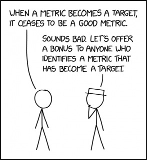
“When a measure becomes a target, it ceases to be a good measure.”
— Goodhart’s Law
In the example above, Facebook might be fine with the deterioration in quality as long as users continue spending time on the platform. But in many cases, if metrics are gamed at scale it causes serious damage.
Example: Let’s say you are offering a referral bonus where users get rewarded for referred signups. What will most likely happen? People will attempt to create dozens of fake accounts to claim the bonus. A better referral metric would require a minimum transaction amount on the platform (e.g. $25) to get the bonus.
So one way to prevent manipulation is by designing the metric to restrict the unwanted behavior that you anticipate. Another approach is to pair metrics. This approach was introduced by Andy Grove in his book “High Output Management” and then quoted, paraphrased and retweeted a million times:
“Andy Grove had the answer: For every metric, there should be another ‘paired’ metric that addresses the adverse consequences of the first metric.”
— Marc Andreessen, a16z (allegedly)
— A bunch of people on Twitter (definitely)
What does that look like in practice? If you only incentivize your customer support agents on “time to first response” because you want customers to get immediate help, they will simply respond with a generic message to every new ticket.
But if you couple it with a target for ticket resolution time (or customer satisfaction), you are ensuring that agents actually focus on solving customers’ problems faster.
Principle 5: A good metric doesn’t have arbitrary thresholds
Many popular metrics you’ll find in Tech companies are tied to a threshold. For example:
# of users with at least 5 connections
# of videos > 1,000 views
This makes sense; often, taking an action in itself is not a very valuable signal and you need to set a threshold to make the metric meaningful. Somebody watching the majority of a video is very different from somebody just clicking on it.
BUT: The threshold should not be arbitrary.
Don’t choose “1,000 views” because it’s a nice, round number; the threshold should be grounded in data. Do videos with 1,000 views get higher click-through rates afterwards? Or result in more follow-on content produced? Higher creator retention?
For example, Twitch measures how many users watch a stream for at least five minutes. While data apparently played into this choice, it’s not entirely clear why they ultimately chose five.
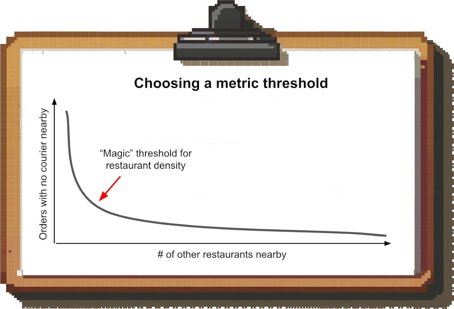
At Uber, we tried to let the data tell us where the threshold should be. For example, we found that restaurants that had a lot of other restaurants nearby were more reliable on UberEats, as it was easier to keep couriers around. We set the threshold for what we considered low-density restaurants based on the “elbow” we saw in the graph:
This approach worked in many areas of the business; e.g. we also found that once riders or drivers reach a certain number of initial trips on the platform, they were much more likely to retain.
You are not always going to find a “magic” threshold like this, but you should try to identify one before settling for an arbitrary value.
Principle 6: Good metrics create context
Absolute numbers without context are rarely helpful. You’ll often see press announcements like:
“1B rows of data processed for our customers”, or
“$100M in earnings paid out to creators on our platform”
These numbers tell you nothing. For them to be meaningful, they’d have to be put into context. How much did each creator on the platform earn on average? In what timeframe? In other words, turning the absolute number into a ratio adds context.
Of course, in the examples above, some of this is intentional; companies don’t want the public to know the details. But this problem is not just limited to press releases and blog posts.
Looking at your Sales pipeline in absolute terms might tell you whether it’s growing over time; but to make it truly meaningful, you’ll have to connect it to the size of the Sales team or the quota they carry. This gives you Pipeline Coverage, the ratio of Pipeline to Quota, a much more meaningful metric.
Creating these types of ratios also makes comparisons more insightful and fair; e.g. comparing revenue per department will make large departments look better, but comparing revenue per employee gives an actual view of productivity.
Principle 7: A metric needs a clear owner that controls the metric
If you want to see movement on a metric, you need to have a person that is responsible for improving it.
Even if multiple teams’ work contributes to moving the metric, you still need a single “owner” that is on the hook for hitting the target (otherwise you’ll end up with a lot of finger-pointing).
There are three separate failure modes here:
No owner. With nobody obsessing about improving it, the metric will just continue on its current trajectory.
Multiple owners. Unclear ownership causes friction and lack of accountability. For example, there were times at UberEats where it was unclear whether certain metrics were owned by local City teams or Central Operations teams. For a short period of time, we spent more time meeting on this topic than actually executing.
Lack of control. Assigning an owner that is (or feels) powerless to move the metric is another recipe for failure. This could be because the owner doesn’t have direct levers to control the metric, no budget to do so, or a lack of support from other teams
Principle 8: A good metric minimizes noise
A metric is only actionable if you can interpret its movements. To get a clean read, you need to eliminate as many sources of “noise” as possible.
For example: Let’s say you’re a small B2B SaaS startup and you look at web traffic as a leading indicator for the top of your funnel. If you simply look at the “raw” number of visits, you’ll have noise from your own employees, friends and family as well as existing customers visiting the website and you might see little correlation between web traffic and down-funnel metrics.
Excluding these traffic sources from your reporting, if possible, will give you a better idea of what’s actually going on with your prospect funnel.
Principle 9: Certain metrics should be industry standard
For certain metrics, it’s important that they can be compared across companies. For example, if you’re in B2B SaaS, your CFO will want to compare your Net Revenue Retention (NRR), CAC Paybacks or Magic Number to competitors (and your investors will want to do the same).
If you calculate these metrics in a way that’s not market standard, you won’t be able to get any insights through benchmarking and cause a whole lot of confusion. That’s not to say that you shouldn’t make up metrics; in fact, I have made up a few myself over the course of my career (and might write a separate post on how to do that).
But the definitions for most financial and efficiency metrics are better left untouched.
Caveats
All of the above being said, I want to make one thing clear: There is no perfect metric for any use case. Every metric will have downsides and you need to pick the “least bad” one. Hopefully, the principles above will help you do that.
Bonus: The Metrics Hall of Shame
A metric shouldn’t be made up to support a business narrative or hide inconvenient truths. This sounds obvious, but there are plenty of funky metrics out there that were created for this purpose:
1. WeWork’s Community-adjusted EBITDA
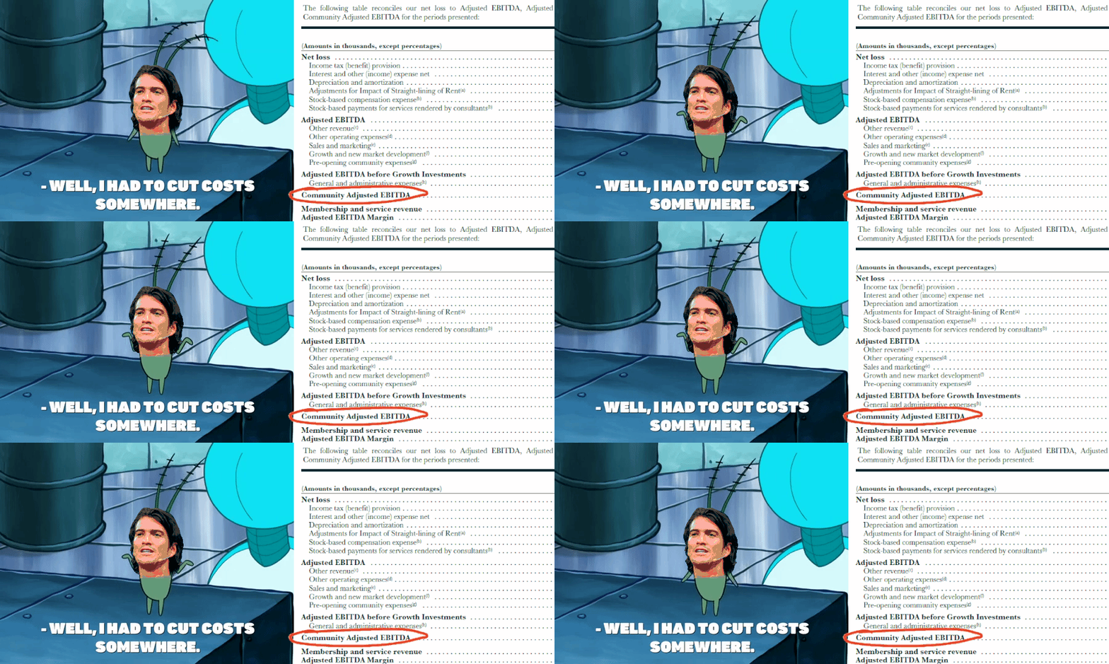
The first place of made-up metrics goes to WeWork’s Community-Adjusted EBITDA.
Adjusted EBITDA has always been known as the land where anything goes; but WeWork’s metric, at first glance, seemed especially… “creative”. In addition to interest, taxes, depreciation and amortization, WeWork deducted stuff like Marketing, General & Administrative expenses etc.
The intention was to show a measure of unit economics, which is not unheard of. But WeWork did a terrible job explaining what the metric does and how it should be interpreted, and that alone earns it a spot on this list.
2. Elon Musk’s “Unregretted User Minutes” for X
What do you do when your core engagement metrics like DAUs are tanking? You tell people that those metrics don’t matter and make up a new metric to focus on instead. Enter: Unregretted User Minutes.
How is that measured, you ask? Nobody outside of X knows; and if I had to guess, neither does Elon or anyone at X.
Social Media is definitely an area that could benefit from a shift away from pure engagement metrics towards something that takes into account the quality of the user experience, but this is much more likely to be a (clumsy) attempt to distract from X’s troubles. I’m not surprised we haven’t heard much about this metric since the initial tweets.
3. Netflix’s 2019 “Views” definition change
How do you make the viewership numbers on your streaming platform go up without actually doing anything?
You change the threshold of what counts as a view!
Until the end of 2019, Netflix counted as a view any time someone watched > 70% of a movie or TV show episode. In late 2019, they set the threshold at 2 minutes instead; that’s not even enough for the cold open intro of most TV shows. So if someone drops off before the opening credit sequence plays, it still counts as a view. No surprise, the new numbers were roughly 35% higher.
Netflix has since changed their metric again, to be fair, and the new one seems more reasonable (total hours viewed divided by runtime; i.e. effectively “full views”).


